The Classics
Pre-2014 Projects
Venmo (2013)
Most of my time at Venmo was spent working on a comprehensive redesign of Venmo’s Android app to bring it up to Google’s design standards (pre-Material Design) and in-line with documented Android patterns. I also designed the documentation and branding for the Venmo Payouts API (a product that allowed gig economy-type businesses to use Venmo to pay service providers), and worked on the second iteration of “Venmo Touch”, an SDK that would allow third party apps to access stored credit card information within Braintree’s network, with a user’s permission. I also redesigned recruiting collateral such as a landing page for jobs at Venmo and our company blog.
Okay, but where are the screenshots?
Yeah, about that... all of my work from my time at Venmo was stored on a USB drive that snapped in half in the bottom of my bag a few years ago. Suffice to say, I learned a very important lesson about cloud storage that day.
Please accept this fail GIF in lieu of screenshots.
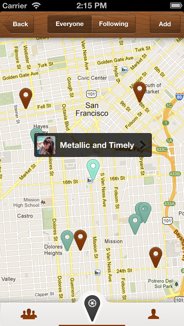
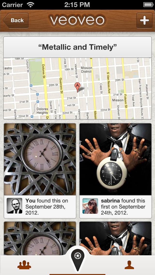
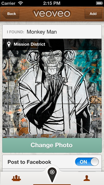
VeoVeo (2013)
VeoVeo was a side project I worked on with Karina Van Schaardenburg, John Wu, and Ben Sandofsky. I was the sole designer working on the app, which was basically a geo-caching and "I Spy" inspired game for your phone. Users could tag interesting objects in their environment (think cool graffiti or architecture) and leave a text clue. When other users were within the same vicinity they could view the text clue and submit a photo of their guess as to what the original object was. Submitting a photo allows the user to see the original photo taken.
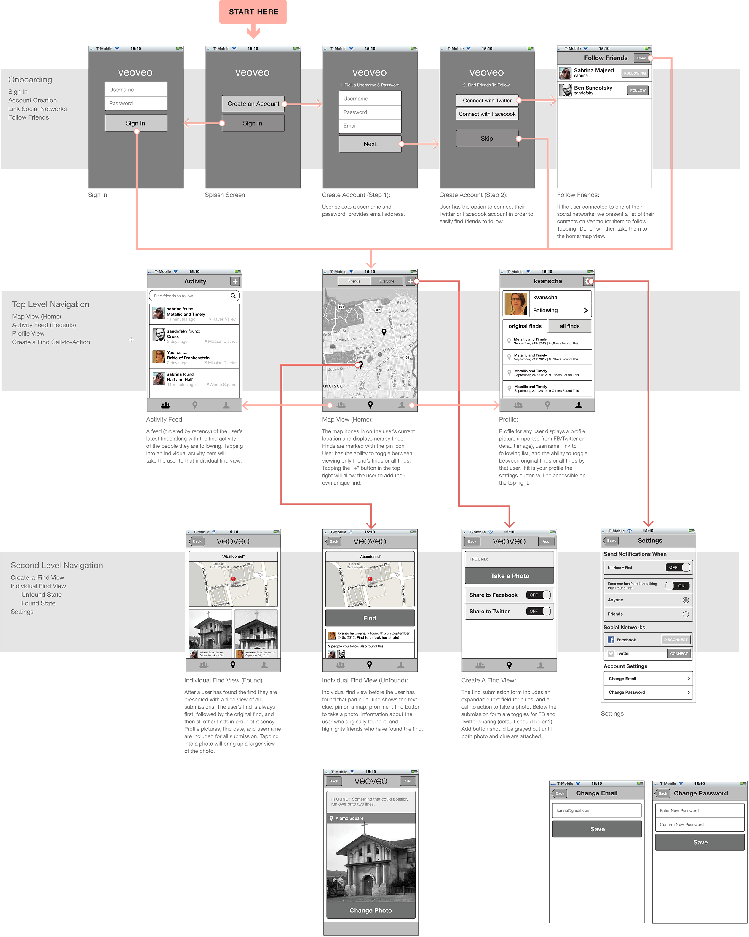
Ah, the good ol' days when I only had to worry about designing for two different devices sizes.
Sometimes I miss iOS 6 aesthetics. Sometimes.
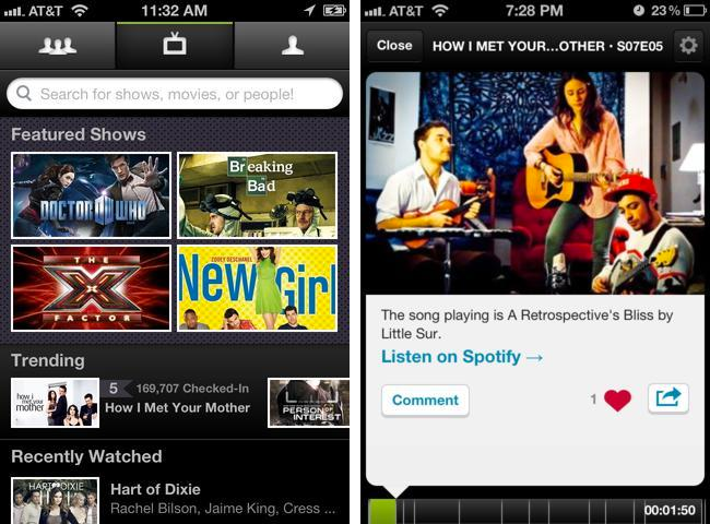
Miso (2011-2012)
Miso was a start-up focused on "second screen" experiences. While there I worked on a design team of two and was primarily focused on the consumer app experience while my colleague focused on web-based creation tools. The main product we focused on were "SideShows", which were basically companion experiences for TV shows that were created by superfans, with content time-stamped to different parts of the episode. For example, if there was a vaguely recognizable guest star on screen,at that moment Miso would tell you who the actor was and where you might recognize them from. Users with a cable could sync the app with their cable box for a more seamless experience, however since most of our users were cord cutters who watched TV through other means, this posed a unique design challenge for us to come up with a more manual way to sync our content.
This was challenging because the "time-stamps" could be drastically different depending on the platform chose to watch a show. For example, Netflix or pirated videos have no commercials. Hulu was some commercials. Cable and Live TV has many. I go in more depth about how we designed around this problem in this talk at MEX.
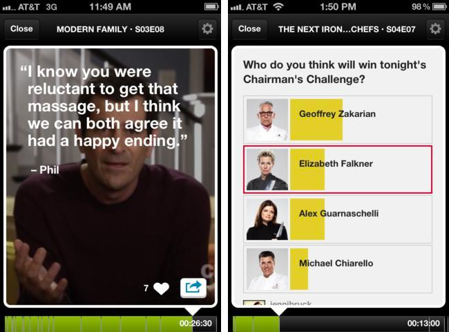
SideShow content could be presented in one of three templates: a fact card, a quote card, or a poll. I worked closely with the creation tool designer to determine how flexible each template should be.
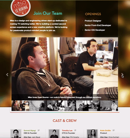
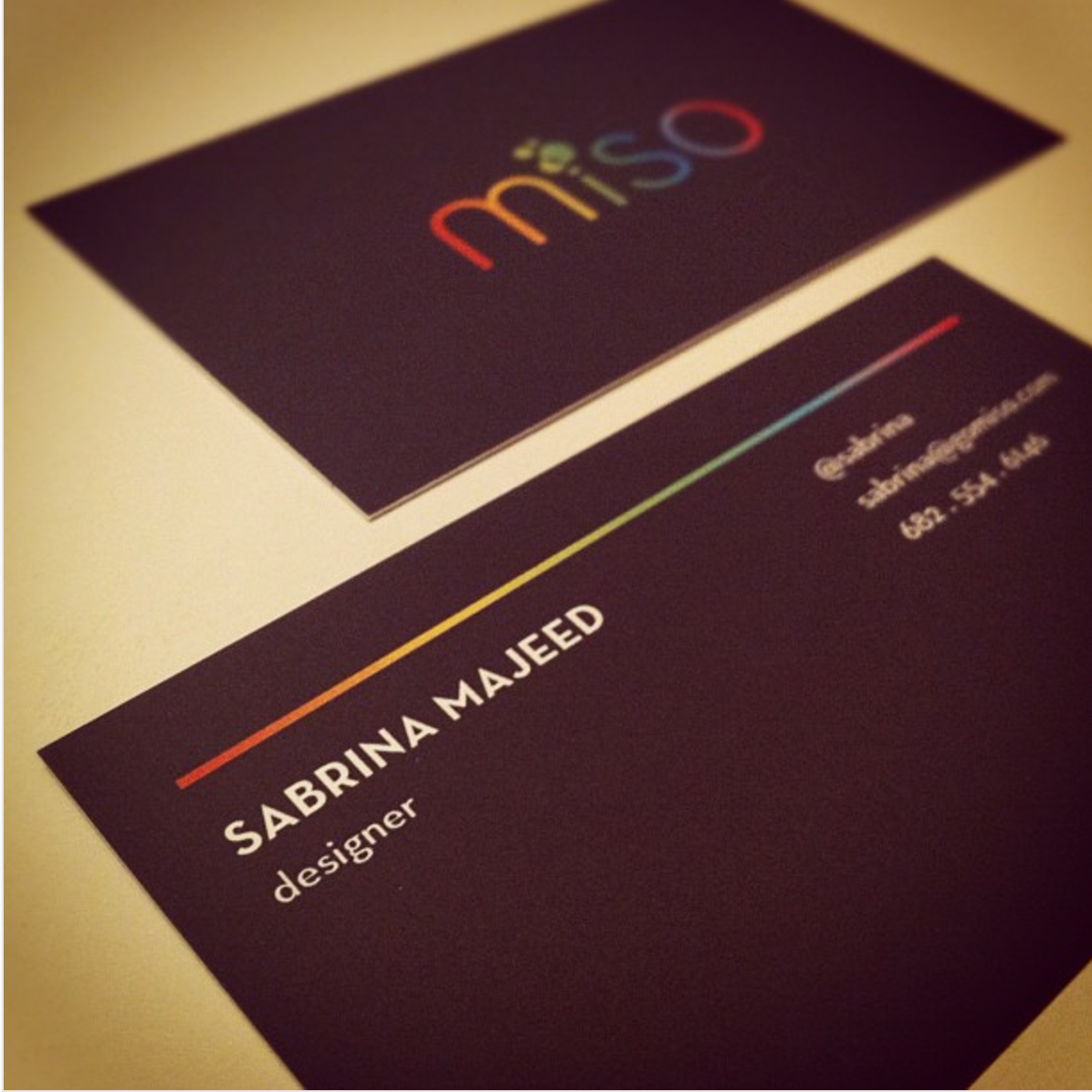
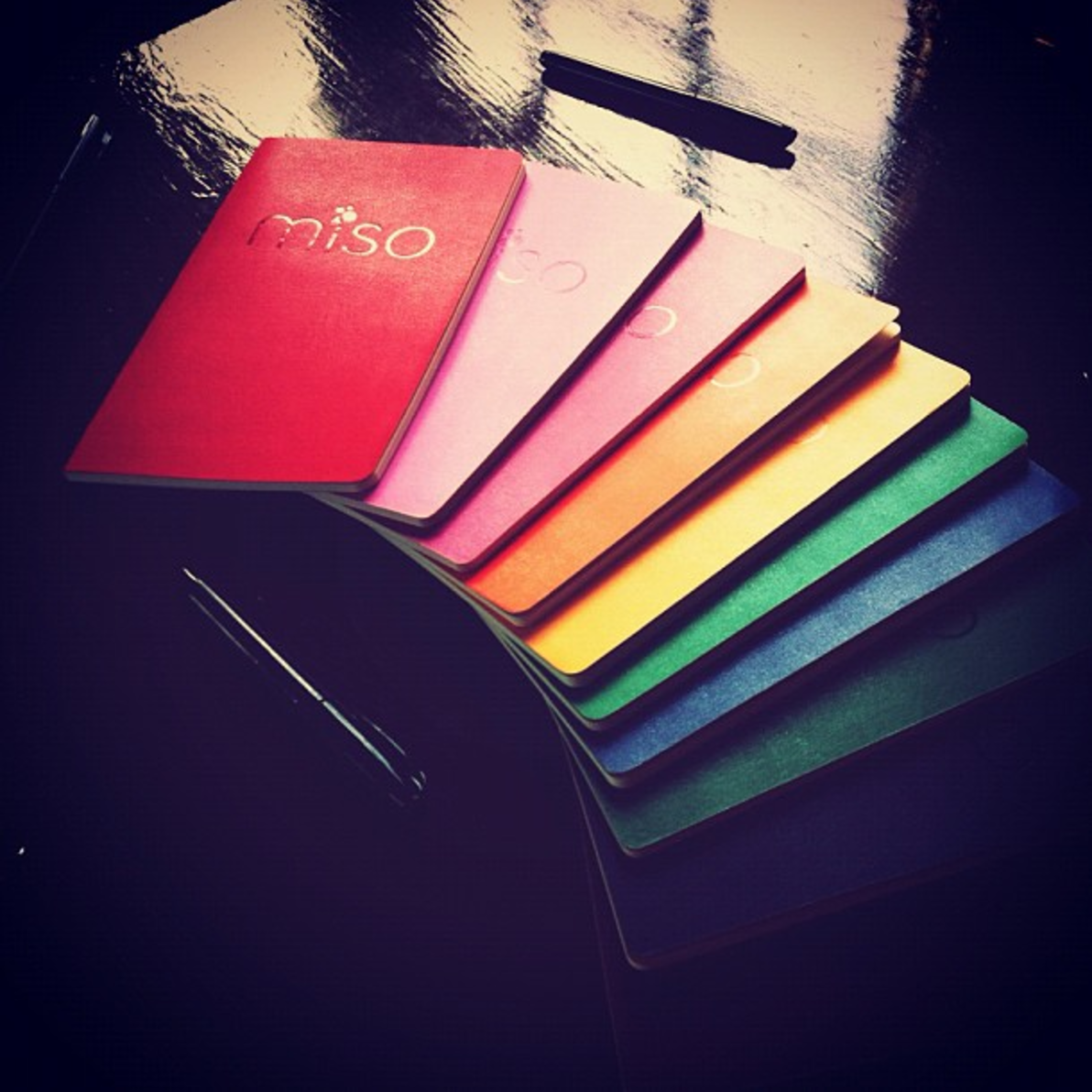
Aside from designing the sideshow feature I also designed the 2.0 version of te app, reconidering everything from navigation to profiles and show pages. After launching sideshows within the app I also designed a web version of the product so that 'sideshows' and individual content cards could be shared on social media for extended reach. While I was there I also worked on redesigning the Miso identity— moving away from soup-related aesthetics to something more media based. As a part of this I got to design a lot of related collateral such as t-shirts, business cards, notebooks, and our jobs page.

Intuit (2010 — 2011)
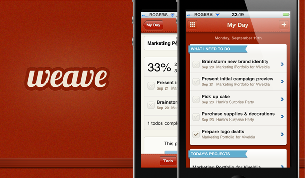
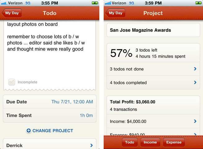
During my first full-time job at Intuit, I focused on visual design for the small business accounting tool, QuickBooks Online. While I was there I got the opportunity to work on my first ever iOS app, a project called Weave. The premise of Weave was to offer both project/task and financial management as a part of Intuit’s non-consumption efforts. There were already many productivity apps on the market and a few financial planning apps but none that combined the two. Our target audience was generally younger than the Quickbooks user, people with side projects as opposed to small businesses. The idea was that Weave would act as a loss-leader and a way to get new customers into the Quickbooks ecosystem. As a part of this I helped develop a brand identity and creative direction for the app.
After launching Weave internationally on the App Store, we ended up with more users than the flagship QuickBooks Online product (granted, our app was free unlike QBO). Though it began as a side project, after a successful launch it was recognized as an official team within QBO and given dedicated resources. We even got a special audience with Intuit founder Scott Cook who commended our efforts. The app's design was also written up in Beautiful Pixels.
Lobster really didn't stand the test of time, did it?